The good, The bad, and those who are gone.

 Wounded 1966 by Robert C. Knight
This painting has a looming feeling of death as this soldier is being carried out on a stretcher. The artists used various colors and shading to show the soldier on the edge of death. A bandage is around the soldier's arm. The man is naked and skinny but has muscle. It's clear to me that he hasn't eaten recently, or if he has, it was very little. This painting does an excellent job of showing the horrific tragedy of war. The cream background adds to the depth of the blues. I would not own this painting because I find it to be screaming death in a way. I also think my daughter would find it scary.
 Last Stand 1967-68 Phillip W. Jones
Last Stand is an oil painting that has many colors and can show depth of emotion. The painting depicts soldiers taking cover behind a sandbag wall during battle. The painting is a powerful representation of war and how brave the soldiers had to be in combat. The painting mainly used earthy tones like browns and greens. These colors are used to create a sense of the natural environment. The use of these colors also helps bring the painting to life in the sense of realism. The painting also uses its lighting and shadows to give depth and contrast to the piece. The lighting highlights the soldiers. I personally think this painting is worth having in a home. I think the hues would look good somewhere in a naturally light room.

Looking Down the Trail 1967 by James Pollock. The painting is done with watercolors; it shows soldiers who are wading in chest-high waters and swamps in the jungle. The soldiers have wings on their backs, almost as if they're in a watery grave. The artist used shadows to create a feeling that these soldiers didn't get to go home. Many soldiers did not make it home to their loved ones. The dirty-looking wings and the ripples of the water show they have been places and they're still going places. I personally would own this. A family member of mine fought in the Vietnam War, and I think he would like this painting.
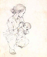
Nursing 1966 By Robert C. Knight Nursing is a linework illustration created by Robert C. Knight in 1966 as part of the Combat Artist Team. The illustration shows a woman nursing her baby in a squatting position. Her hair is up neatly, and she watches as her baby feeds. It is now a part of the U.S. Army Art Collection. The painting has beautiful linework showing how her hair is flowing together. The woman is being protective. I think Robert may have seen this woman during his tour of Vietnam and found the woman so captivating that he decided to paint her. She is strong and could be used as an example of perseverance for the next generation to come. I would own this illustration. I find it to be elegant.

The paintings and illustrations I chose for my Vietnam War Mid-Modern era show the change that became art. Negative impacts on people paint dramatic and in-depth paintings. The artists I chose were soldiers themselves. They had to be vulnerable to do this to be able to show the good and the bad sides of the War. All of the paintings were started and finished in Vietnam or finished in Hawaii.
Buff, H. (2020, October 21). Soldiers created these hauntingly beautiful paintings during the Vietnam War. We Are the Mighty. https://www.wearethemighty.com/articles/soldiers-created-hauntingly-beautiful-paintings-vietnam-war/
Laststa n donzombieisland. (2016, February 29). “Last Stand” – Phillip W. Jones, 1967-68 vcap. Laststandonzombieisland. https://laststandonzombieisland.com/2016/02/28/combat-gallery-sunday-the-vietnam-combat-artists-program/last-stand-phillip-w-jones-1967-68-vcap/
Wikipedia contributors. (2023, September 28). Vietnam Combat Artists Program. Wikipedia. https://en.wikipedia.org/wiki/Vietnam_Combat_Artists_Program


I like the lighting and colors in swamp patrol. The composition of the foreground elements adds a lot of depth. It's interesting to think how artists on battlefields came about. Though I suppose it's for the same reason we have photographers and reporters everywhere we can get them.
ReplyDeleteWounded is fascinating because at first glance the man appears to be dead. In fact, I'm not sure he isn't. The colors, while working well together, are not the ones I would expect to see on a living person. The unfinished nature is interesting to me, how the man is the only thing that is more than lines. To me it either means that nothing else was worth focusing on, or it it some kind of commentary about life being empty and cut short in war.
The Last stand is one of my favorites in this list. The colors add to the dire feeling expressed in the title and the poses of the soldiers. The triangular composition pointing towards the one man with his arm out and how everyone appears to be on their knees makes it seem almost like a spiritual experience. Like if it were a movie, the sounds of gunfire would be masked with swelling music.
The watercolor shapes of looking down the trail leave the image a little hard for me to decipher. I think those shapes are leaves, but it is intriguing if they are wings. The muddy colors add to the dourness of war, and maybe the indistinct outlines in the background are simply because it isn't as important.
Nursing seems to stick out in this art lineup because it is not immediately obvious that it is war related. The drawing has a lot of weight to it, the shapes are just linework, but it really feels 3D, which is cool. It seems a curious thing to associate with war, but I can't imagine it's all terrible. Maybe it was one of those good moments that the artist decided to remember instead.
Unreal realities has quite dramatic lighting that fades out the borders of the shapes. An interesting artistic choice to be sure, but not one I dislike. Another thing I find curious is one soldier having some kind of laser rifle while one has a regular one. It makes me wonder if the violence separates you from yourself, like an alien.
I had no idea about the Vietnam Combat Art Program, this was very fascinating to learn about. My favorite of these is Unreal Realities. I love the bold colors and the use of the colors as shading contrasted with the harsh lighting. The painting is pretty brutal and fits well the the title. The harshness of the reality of war. It's so harsh that sometimes it doesn’t even feel real. The use of the watercolor like wash in the back is also very nice.
ReplyDelete